
Early period legal documents conferring titles, rank, and terms of vassalage were typically plain with no illuminations or decorations apart from an initial capital letter that had some extra flourishes. These documents typically had one or more wax seals hanging from the bottom to confirm the validity of the document. Legal documents were rolled up for safekeeping and for transport much like the scrolls that were used by the clergy (prior to codices and books)--hence the term "scrolls" in modern SCA parlance.
Later in period (during the 15th century and onwards) we find that many nobles were Granted Arms by Letters Patent. This provides the SCA with its inspiration for three of its levels of recognition: Award of Arms, Grant of Arms, and Patent of Arms. The award scrolls we are familiar with in the SCA are similar to those 15th century Grants in that these are "legal" documents conferring titles, rank, and (occasionally) duties, and they have an illumination depicting armory belonging to the Grantee, a wax seal, signatures, etc.
However, since the SCA covers such a broad segment of time and geography, it isn't always appropriate to style every award after a 16th century Grant. With otherwise plain-looking legal documents to represent earlier periods, what other sources of inspiration can we (literally!) draw from? Liturgical books, scrolls and codices, psalters, textbooks, bestiaries, and even period novels are excellent resources. In early period, liturgical works were the main sources of written material and were generally highly decorated to further increase the awe generated by the written word. During the 12th and 13th centuries, however, an increased demand for lay books brought more written material within reach of the public. Later in period, as more secular works were provided for learning and pleasure reading, illuminations could be found outside of the Church. It is to these sources that we primarily look for inspiration to decorate award scrolls.
The first question most scribes ask when thinking about creating an award scroll is, "Where do I start?" If you know your intended recipient, you may already have your answer! First, start by asking what segment of Period do they like? Where is their persona from? What is their taste in period art? Once you have the answers to these questions, find examples from period manuscripts that fit the criteria. Don't get discouraged if you don't find things immediately! There are numerous resources on-line to help you with your search, and that includes all those helpful scribes around the Known World who are typically very glad to assist you in tracking down a bit of information for your project.
If you don't know the recipient, then you can virtually do as you please--as long as you follow the requirements set forth by the Scribes' Handbook for the Kingdom you are serving! Some have very strict guidelines about the size of armory on a scroll, what can be displayed on an achievement of arms, etc.
One thing to remember about any award scroll is that the armory associated with the award should be the primary illumination--after all you want to make sure people know what the award is for! You certainly don't want to force people to play "Where's Waldo?" with the badge for an Order or the person's own arms!
Many a scroll that I have done has been based on an existing illuminated manuscript. The knotwork and ivy border that I have used in several projects is an example. There are many methods of translating an existing illumination onto your page. A standard light-table can be used (and is actually close to a period practice of tracing designs using the light from a window) for tracing. A photocopier and light-table can allow you to resize an illumination to fit your page, and then you can easily translate the design onto your paper. However, if you are using Bristol board or real parchment, use tracing paper to copy the design, then transfer it by rubbing the pencil lines onto your page. The grid measurement and copying method is period, so it works, but it can be tedious work.
The drawback of using an existing design is that you are automatically limited in how much space you allow for calligraphy. In this situation, I have found that making an outline of my "writing space" onto a scrap piece of paper allows me the freedom to practice filling the text into the area. A computer with the right fonts and a printer can help with this task (personally, I do NOT use this method--it feels too much like cheating to me.
The major advantage of utilizing an existing design is that your work will have the correct proportions for an illuminated manuscript and if you choose the correct calligraphy to match, will have a more authentic flavor.
If you plan to work in the same fashion as the medieval artisan, you may want to consider that illuminations from period were rarely gratuitous. Decorations were intended to enhance the text and to draw the reader's eye to important points. Consider what the award is and how to convey that idea visually. Without paying heed to this concept, your work may seem random and incomplete. Even your choice of calligraphic hand can have a tremendous effect on the success of your effort. For example, something about Irish Uncial paired with an Italian Renaissance illumination just doesn't seem right.
How the scroll is to be displayed can help determine the size of your pages. Picture framing can be expensive, so you may wish to plan your work around standard frame sizes (8 x 10, 8.5 x 11, 11 x 14, etc.) to help alleviate this cost from either yourself or the recipient. This is merely a suggestion! If you look back at the Viennese augmentation, period manuscripts were not created in standard sizes!
Once you've chosen your page size, how should things be arranged on the page? Christopher Jarman notes that there is a "golden rule" of page design for calligraphy. It provides the optimum proportions for margins, text area and decorations on a book page--and it works no matter what size the page is! This method was devised in the thirteenth century by Picardy architect Villard de Honnecourt.
- Draw the long diagonals AD, CB.
- Draw the short diagonals CE, DE.
- Draw the vertical FG.
- Draw the line GH
- You know have point Q. Draw horizontal lines to cut CB and vertical lines to cut ED to get "perfect text margins"
De Honnecourt's method of page layout was not universally used, of course. A ninth-century formula for mathematically laying out pages is a bit vague: Using a page that is five units high by four units wide, the height of the written space should be four such units. The inner and lower margins should be three times as wide as the outer margin and as the gutter between the columns (assuming a two-column book) and a third wider than the width of the upper margin. The ruled lines should then be spaced according to the size of the writing. However, one thing to note from this text and from observation of extant texts is that experts agree that the most elegant-looking manuscripts have a written space whose height equals the width of the page.
If you plan to design your scroll around columns, the number of columns will vary depending on the century and the text. De Hamel notes: Early codices will have multiple columns (betraying their origins as scrolls), and early Irish (and Irish-influenced texts) can have one or two columns. Further, de Hamel writes:
Carolingian and Italian Renaissance manuscripts were typically one wide column. Romanesque and Gothic textbooks were in two column format. French and German literary romances will frequently be found with short lines in triple columns. Books of Hours have one column and Breviaries two. Glossed biblical manuscripts are usually in three columns: a broadly spaced central column for the scriptural text and narrowly ruled outer panels for the commentaries in smaller script.


One of the primary requirements for an SCA award scroll is to display the armory associated with an award--be it a badge of an Order or the person's own armorial bearings (with various accompanying Achievements of Arms that may come with it). One good question to ask is "How did they do it in period?" The answer is not quite so simple. Depending on region and time, armorial display will vary.
The majority of armory found in period manuscripts can be found in rolls of arms--which are typically associated with either tournaments or with heraldic visitations. One of my favorite sources of heraldry "in context" is the Manesse Codex (c. 1330). Nearly every illuminated page contains armory!
Of course, heraldry can be displayed in illuminations in a myriad of other ways! Quite often, English grants of arms by letters patent will show the full achievement of arms with a depiction of how the armory may be displayed on banners, standards, gonfalons, etc.
Images of banners and James Sitfilt are from Heraldic Standards

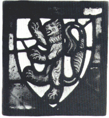
Lest we limit ourselves to one type of reproduction, do not forget that heraldic display occurs in other forms. Brass funerary plaques are a good source for medieval artwork as are stonework and stained glass. Wealthy patrons of churches were commemorated for their donations with displays of heraldry in floor tiles, stone carvings, woodwork, and stained glass windows.
Even "pre-heraldic" art forms such as the Ringerike Runestones can be used to add a great deal of interest to an award--although wood or stone is probably a better medium for a project such as this.
Funerary plaques such as can be found in almost any English church are an excellent source for a scroll illumination and heraldic display.
Bedingfeld, Henry and Peter Gwynn-Jones. Heraldry. Secaucus, New Jersey: Chartwell Books. 1993. ISBN: 1-55521-932-2
De Hamel, Christopher. Medieval Craftsmen: Scribes and Illuminators. London: British Museum Press. 1995. ISBN: 0-7141-2049-9
Drogin, Marc. Medieval Calligraphy: Its History and Technique. New York: Dover Publications, Inc. 1989. ISBN: 0-486-26142-5
Gayre of Gayre and Nigg, Lt. Col. Robert. Heraldic Standards and Other Ensigns. Edinburgh: Oliver and Boyd. 1959.
Jarman, Christopher. Illumination: A Source Book for Modern Calligraphers. London: B.T. Batsford. 1994. ISBN: 0 7134 7824 1
Marks, Richard and Anne Payne ed. British Heraldry. London: British Museum Publications, Ltd. 1978. ISBN: 0 7141 0086 2
Von Neubecker, Ottfried. Heraldry: Sources, Symbols and Meaning. London: Tiger Books International. 1997. ISBN: 1-85501-908-6